Chapter 02
Understanding the uncertainty
Over four days, I conducted six remote interviews with three university students, two working professionals, and one gig worker. I explored how they found street food, what disrupted a quick meal, and what would make preordering useful.
Time pressure changes the decision
Participants described giving up when queues looked too long.
Design implicationPrioritize availability and preparation information so people can make a quick decision.
Location and waiting time are uncertain
Finding a vendor did not always mean knowing whether it was open or how long food would take.
Design implicationBring discovery, vendor status and pickup estimates into view.
Control should take little effort
People wanted to order and collect without repeatedly asking what happens next.
Design implicationKeep selection, confirmation, tracking and collection easy to follow.
Quotes recorded in the original research document
“I’ve skipped eating just because I saw a long line and couldn’t wait.”
“It’s hard to trust if the food will be ready. I want to see progress or at least a timer.”
Two more interview quotes
“Sometimes I walk around just guessing if vendors are open or even nearby. I wish I had a map.”
“If I can just scan a code and go — that’s the dream. No talking, no confusion.”
Four contexts for a quick meal
The personas synthesize different needs and habits, rather than representing four interview transcripts.
Age 21
University student
Goal
Fit a meal between classes without a long queue.
Key frustration
Busy stalls and unclear locations or operating hours.
Habits and preferences
Mobile-first, budget-conscious, values speed and convenience.
Age 32
IT executive
Goal
Get lunch within a one-hour break.
Key frustration
Peak-hour queues, unclear opening status, unreliable preparation estimates and waiting in the sun.
Habits and preferences
Familiar with delivery apps; prefers quick, reliable workflows.
Age 24
Intern
Goal
Save time and money when eating out.
Key frustration
Unsure which vendors accept mobile orders, when food will be ready and where vendors can be found.
Habits and preferences
Mobile-first; values tracking and transparency.
Age 28
Delivery rider / student
Goal
Fit meals between jobs without wasting time.
Key frustration
Missing vendors, unknown waits and needing to ask for menus.
Habits and preferences
App-savvy; values real-time location information.
Chapter 03
From discovery to collection
I mapped the meal as four connected stages. Each stage needed to answer a different question: where to eat, what to order, when to arrive, and how to collect.
Discover
- Touchpoints
- Home, map concept and vendor pins.
- Action
- Browse nearby vendors.
- Friction
- Too many options, uncertain availability and weak filtering.
- Opportunity
- Useful filters and clearer vendor information.
Preorder
- Touchpoints
- Vendor menu, item selection and confirmation.
- Action
- Select food and place a preorder.
- Friction
- Uncertain preparation and pickup timing.
- Opportunity
- A pickup estimate and clear confirmation.
Track
- Touchpoints
- Order tracker, stepper and status updates.
- Action
- Follow preparation progress.
- Friction
- Anxiety about timing and missing collection.
- Opportunity
- Clear status labels and useful pickup guidance.
Collect
- Touchpoints
- QR screen, vendor stall and collection confirmation.
- Action
- Present the pickup code and collect food.
- Friction
- Unclear pickup instructions and vendor delays.
- Opportunity
- Explain collection and offer an order-ID fallback.
I explored bringing discovery, preparation visibility, and collection into one focused pickup journey.
Historical competitive exploration
The exploration considered Uber Eats, Yelp, FoodPanda and a category called Local Street Vendor Apps. These criteria helped frame questions for StreetBite; they do not establish current competitor capabilities.
| Criterion | Relevance to the concept | Competitor result |
|---|---|---|
| Vendor location | Find a nearby stall. | Not verified in supplied evidence |
| Preorder pickup | Order before arriving. | Not verified in supplied evidence |
| Queue visibility | Understand a possible wait. | Not verified in supplied evidence |
| Pickup ETA | Plan when to collect. | Not verified in supplied evidence |
| Mobile UI | Use the flow on the move. | Not verified in supplied evidence |
| QR collection | Identify the order at pickup. | Not verified in supplied evidence |
| Ready-to-collect notifications | Know when to return to the stall. | Not verified in supplied evidence |
Chapter 04
Making the flow understandable
I organized the main path around choosing a meal and collecting it. Account and browsing options stay secondary to that task.
Get started
- Onboarding
- Mobile-number entry
- OTP verification
Choose a meal
- Map / list discovery
- Vendor details
- Food and quantity
Order and collect
- Review / place order
- Tracking
- QR collection
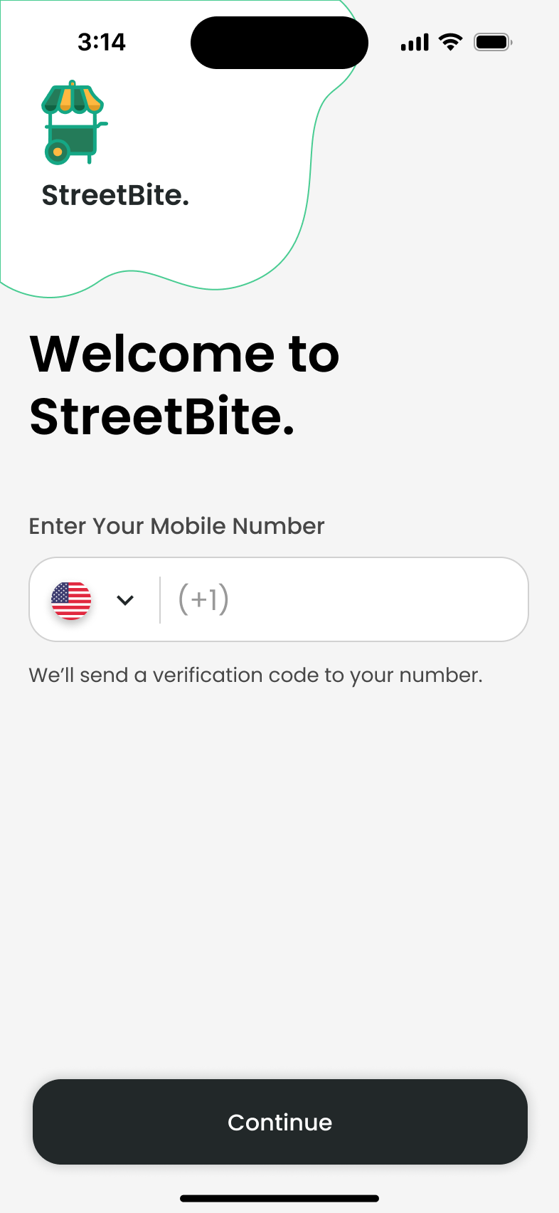
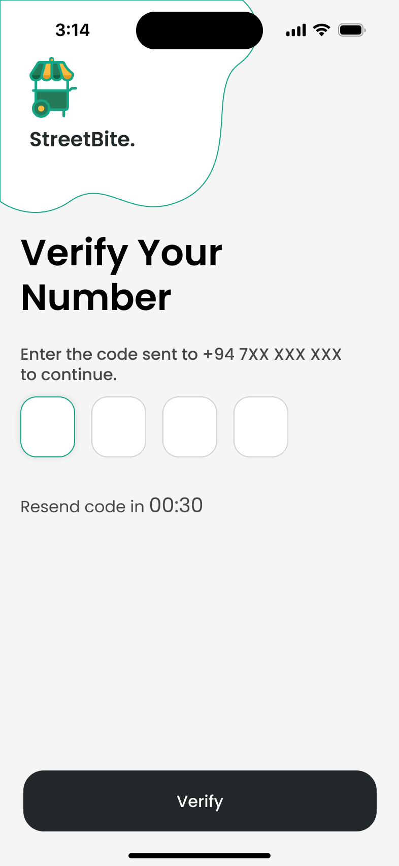
Welcome and verification states
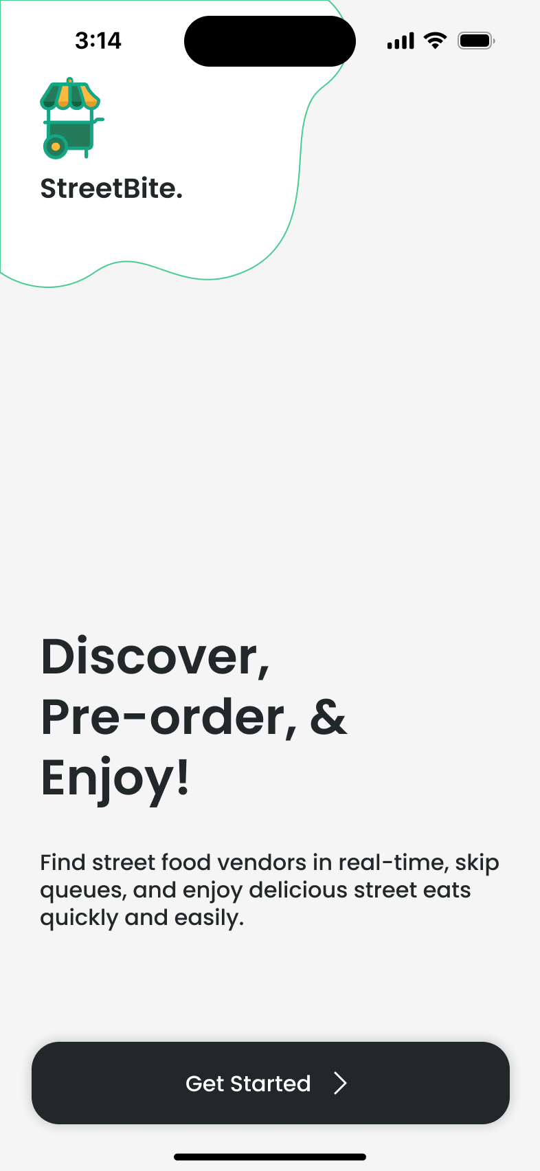
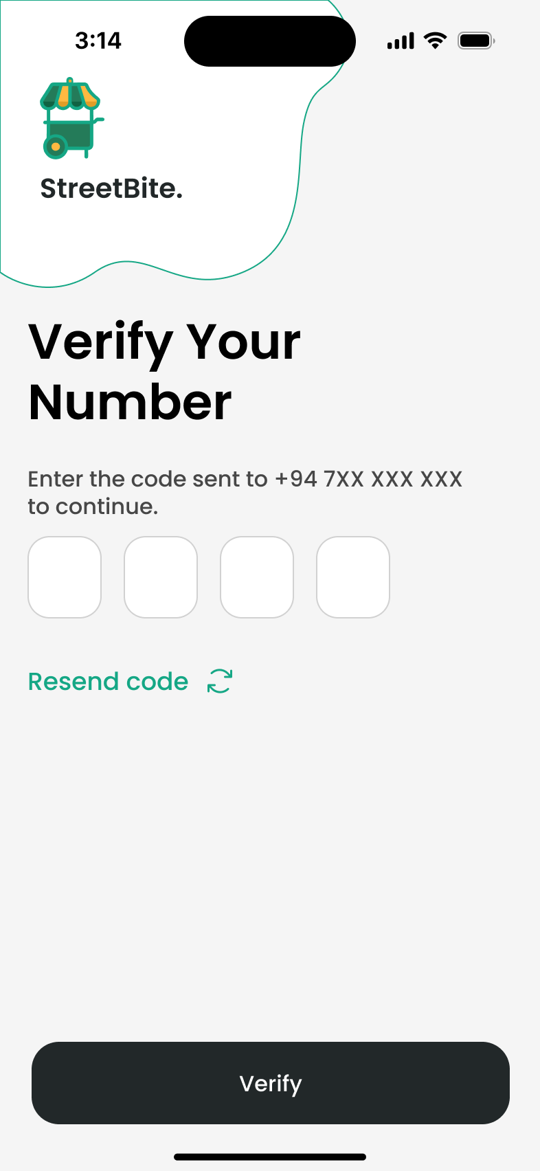
What changed through iteration
- Too many choices
- Introduced filters and preparation estimates to support a more focused choice.
- Uncertain pickup timing
- Clarified the tracking sequence.
- Missed confirmation
- Simplified the confirmation to one clear action.
The original journey account reports clickable-prototype tests with six participants. Separately, the wireframe account describes feedback from four user tests. I used the feedback to refine navigation, hierarchy and confirmation.
Low-fidelity screen set · exports needed
The PDF documents the wireframes. Separate PNG exports are still needed for these screen pairs.
Phone-number wireframe
OTP wireframe
Map-discovery wireframe
Vendor-detail wireframe
Menu/cart wireframe
Tracking wireframe
Ready-to-collect wireframe
QR-pickup wireframe
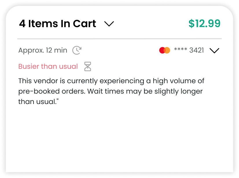
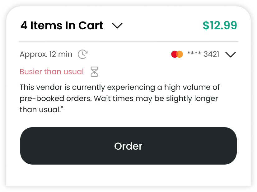
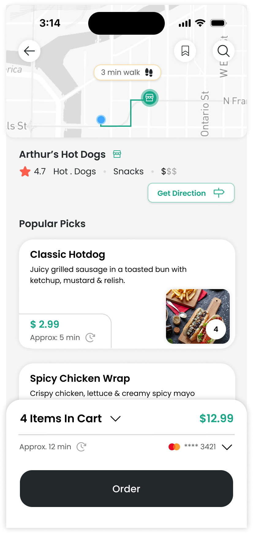
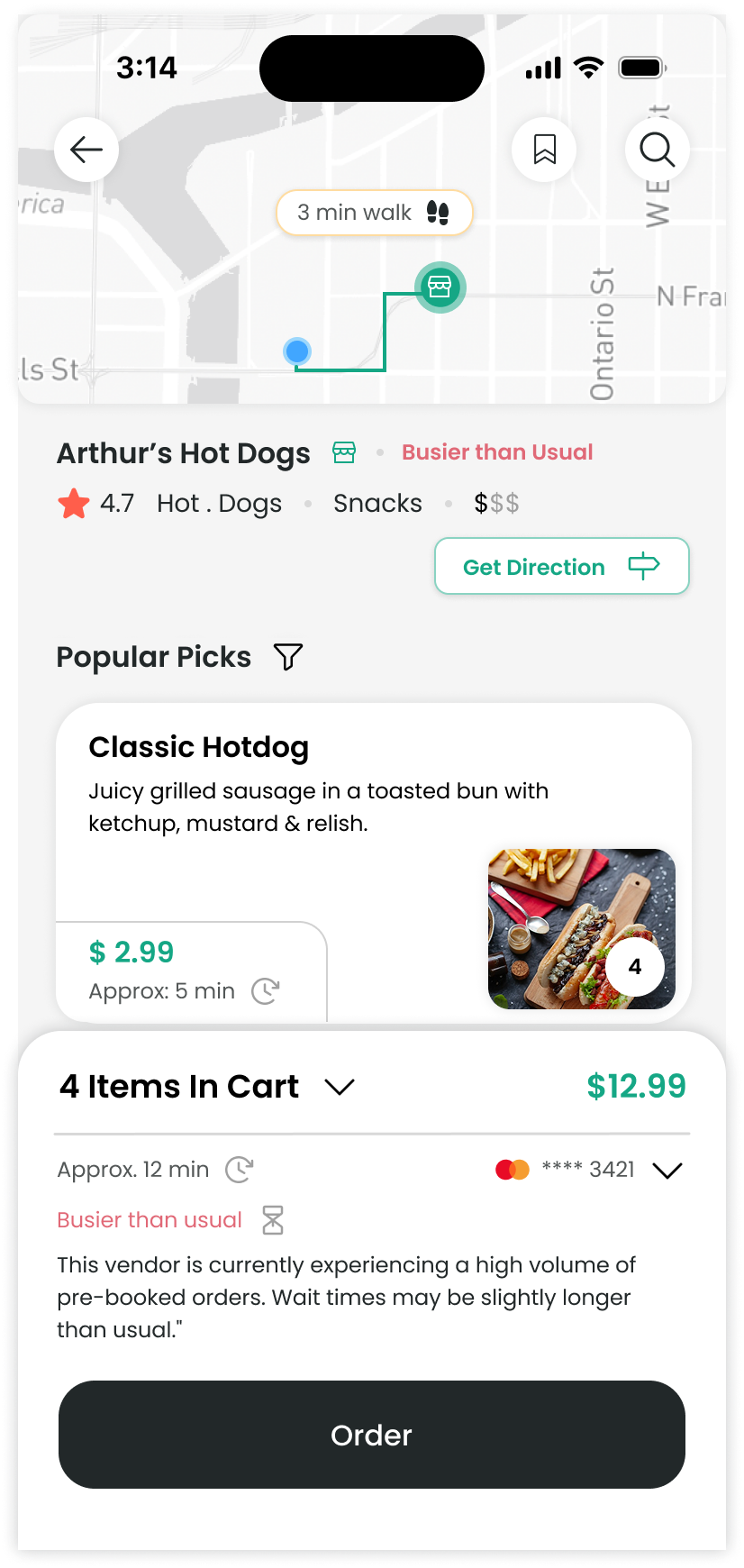
Preparation information at the order action
These cart-panel variants keep the order total and preparation estimate beside the Order action. The expanded notice also explains that a busy vendor may take longer.
Chapter 05
The interface, at key moments
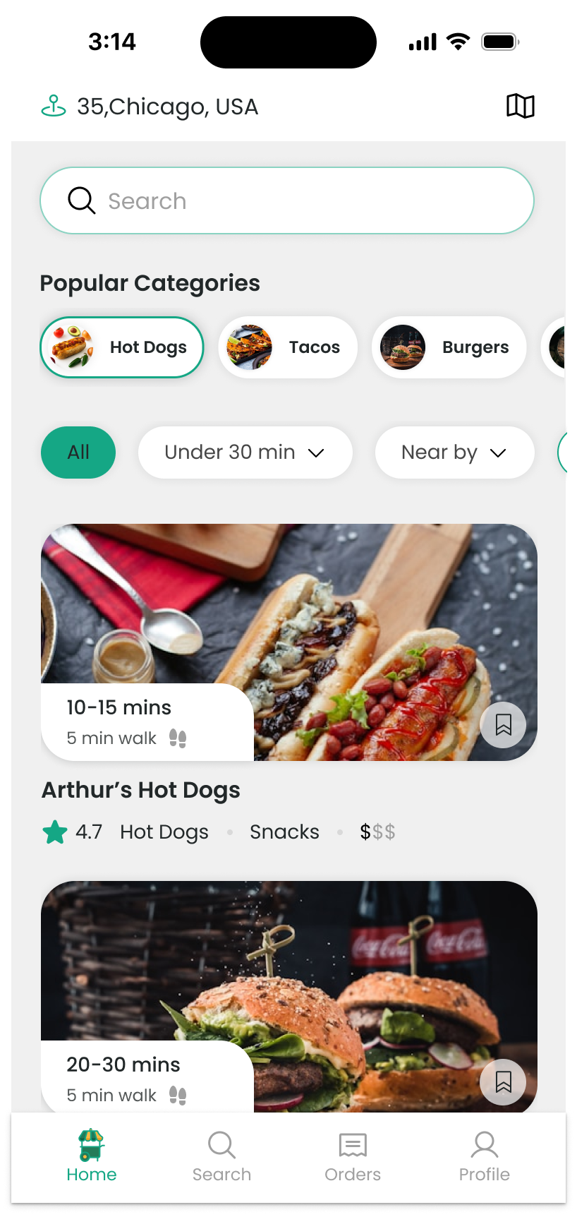
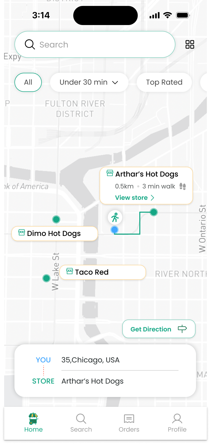
Find a vendor before committing
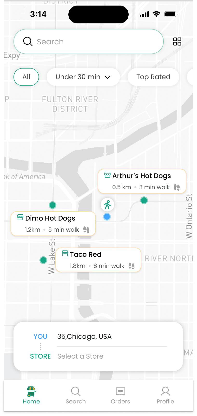
A map-first discovery screen brings vendor choices into context. Filters and vendor details help people narrow the options before starting an order.
Understand the order
Food selection, quantity, cart information and the Order action are kept close to the task. The busy-vendor variant explains a possible longer wait before the customer commits.
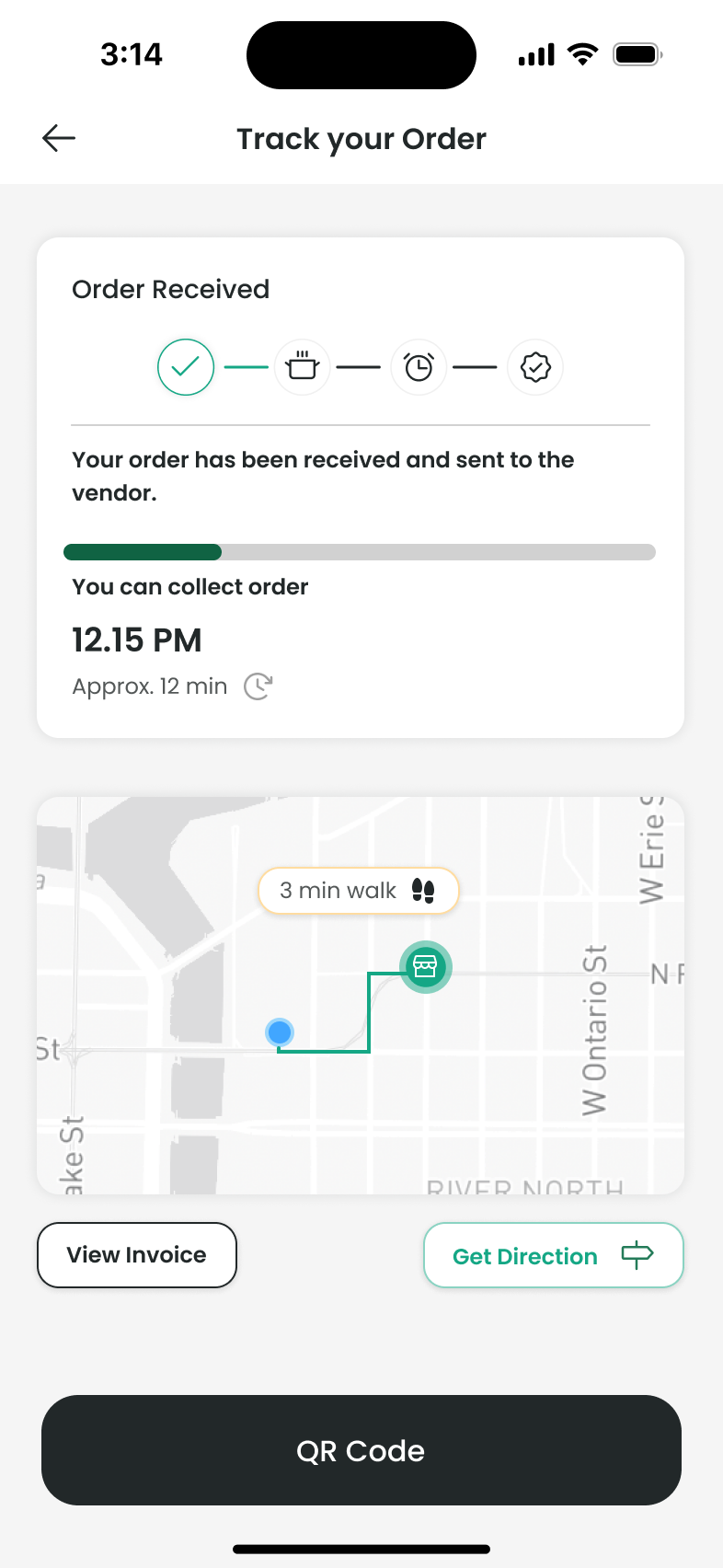
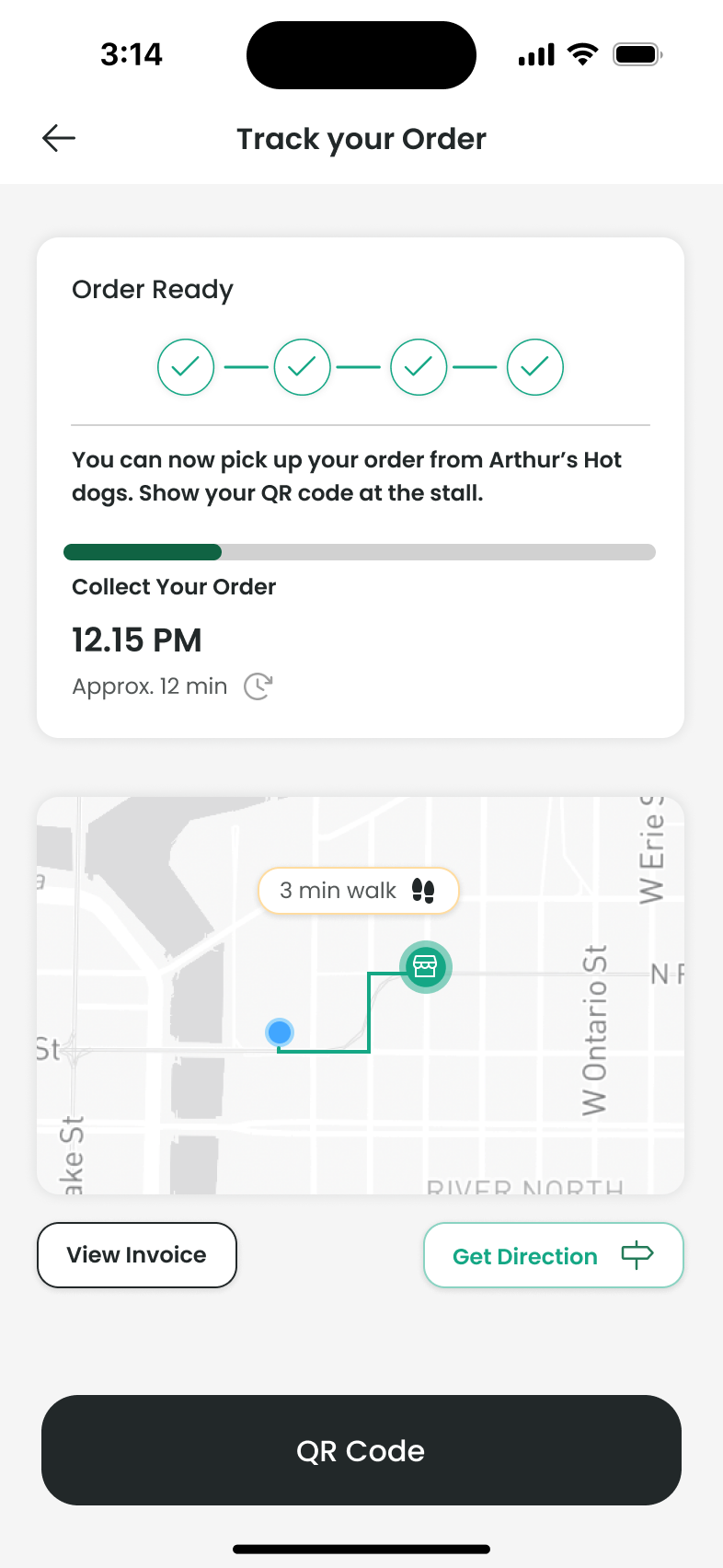
Follow progress to pickup
The four-stage tracker shows an order moving from received to ready. A collection estimate and a separate walking estimate help explain when to set off. The ready state tells the customer to show a QR code at the stall.
Make collection clear
The pickup screen presents a QR code for the vendor to scan, with an order ID available if scanning is difficult. An order summary stays on the same screen.
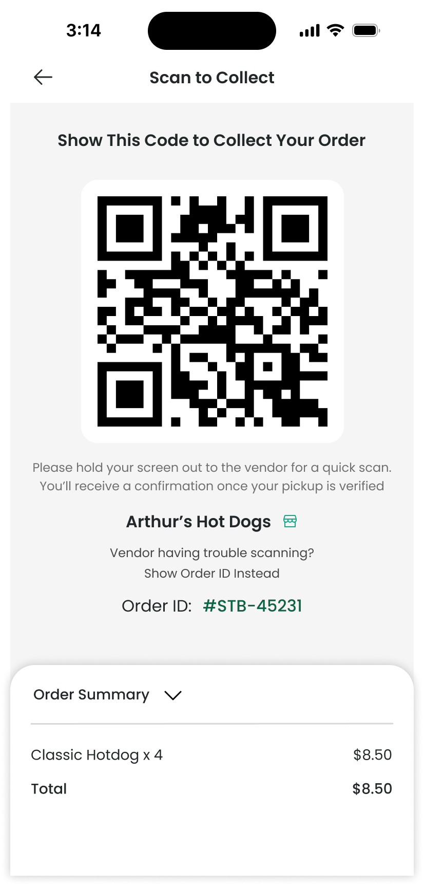
Vendors, locations, prices and order IDs shown in these screens are prototype content.
Chapter 06
Changes and next questions
The design evolved toward a more focused pickup journey: clearer vendor filtering, preparation information, an explicit order tracker, and a simplified confirmation. These changes respond to the uncertainties described in the original research. The next step would be to validate the flow in realistic pickup situations, including changing preparation times and unsuccessful QR scans.
Chapter 07
Continue exploring
I developed the concept through research, user journeys, wireframes, interface design, prototyping and usability evaluation. The work focused on helping someone make a decision under time pressure, then understand what happens after ordering.
My main takeaway is to keep the next useful piece of information close to the decision: preparation time when choosing, progress after ordering, and a clear way to identify the meal at collection.
Keep exploring